

ROLE
Lead designer
TEAM
Design manager, lead designer, QA, and a developer
TIMELINE
Ongoing
SUMMARY
Sign is a digital document signing solution for freelancers and small business owners using the iCount business management system. Sign allows you to create, customise, manage, and send contracts, proposals, NDA’s and more at the click of a button.
This case study will delve into the creation and editing documents flows of the feature, while providing an overview of the final product and its functionality.
iCOUNT SIGN
Seamless document signing integrated into the iCount system for small business owners
So what's the problem?
TL;DR
Our users, primarily small business owners and freelancers, need a streamlined, integrated solution for sending documents for digital signatures without relying on external platforms like DocuSign. They require a way to create, customise, and manage documents - from contracts and quotes to tax invoices - all within the iCount system.
Additionally, their recipients need an effortless way to complete, sign, and return documents electronically.
Diving deeper
By going through user complaints, suggestions, and feature requests in our Intercom tech support system, as well as researching testimonials of users online, these were the most reoccurring pain points:
1. Losing time and resources with pen + paper contracts, especially if one or more parties has to travel in order to sign the document.
2. Endless email chains.
3. Human error.
4. Inefficiency in tracking data and documents.
5. Reusing common contracts - frustrating to keep reprinting and refilling the same document.
Based on these common pain points, we came up with the four main objectives listed in the below section.
OBJECTIVES
1.
Develop integrated document signing capabilities
Implement a feature that allow users to upload, edit, and send documents and contracts directly within the iCount system.
2.
Centralised document management
Ensure that documents in our system are stored in one place, making it easier to track, organise, and access signed documents.
3.
Document diversity and templates
Ensure the system can accommodate different document types, including tax invoices, quotes, sales agreements, and employment contracts, to cover a broad range of business needs.
4.
Recipient ease-of-use
Create an intuitive signing interface for recipients, enabling them to easily fill out forms and digitally sign contracts or agreements with minimal steps.
COMPETITOR ANALYSIS
Feature analysis
I approached my research from two angles:
1. Products dedicated to digital signing
2. Online accounting systems with integrated signing features
This allowed for a balanced comparison between standalone signing solutions and those embedded in complex systems like ours.
For digital signing, I focused on Docusign and Pandadoc, as they’re top products consistently referenced by Gartner and other tech sources like TechRadar.
In the second group, I included Honeybook, Indy, and Paperform. Honeybook and Indy are all-in-one platforms with e-signature capabilities alongside invoicing, expense tracking, and client management. Paperform's Papersign isn’t an accounting software, but I found it during my research on recipient interfaces and noted its extensive signing features.

Create document flow research
I analysed our competitors' flow structures, focusing on each platform's primary action—either uploading the user’s own document or selecting from templates. Honeybook and Indy direct users to select from their extensive libraries of professional, ready-made templates. Other competitors, however, either balanced both options or prioritised document uploads, offering only user-created templates instead of a pre-made library.

Conclusion
As one of the objectives of this feature is to rid our users’ necessity of using third-party tools, our product would need to meet the basic standards of our competitors. Hence, it would need the following:
1. The ability to either upload a PDF document or to have a Rich Text Editor
2. The ability to create templates from the user’s document AND/OR provide an extensive library of professional templates
3. A way of tracking user’s progress and keeping documents secure
4. Different types of fields with at least a text and signature field, and custom content fields (fields that the user can fill in on the spot)
As I’m going to also focus on the “create document” flow in this case study, most of our competitors had two to three steps (with 1-2 steps being most common):
1. Upload doc or select template
2. Add/edit document name or add recipients
3. Document settings or email message
IDEATION: CREATE DOCUMENT FLOW
User flow
From my research above, most start document flows ranged from 2-4 steps, and I streamlined ours to two:
1. Upload doc or select template
2. Add recipients
Because our edit document interface will include an option to rename the document, adding a name field here would only clutter the flow.
Lowfi wireframes
STEP ONE: I did a Crazy 6s exercise in order to play around with the layout of Step One. The most successful one was the bottom middle - it has equal hierarchy between the document uploader and the templates
STEP TWO: The 3rd wireframe in this sprint was the one we initially developed - however after testing (and I will elaborate on this in the User testing section), the design was changed to the last two options.

First iteration
STEP ONE: At its first stage, we released Sign without Templates - as an MVP so the first step of the modal was simply a document uploader, and we had not yet connected the system contact library to Sign.
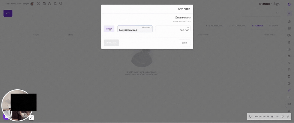
STEP TWO: In the MVP stage two, users can add recipients using two different views: a single-recipient view for when there’s one recipient, and a multi-recipient view for multiple recipients. After filling in recipient details, users can click “Add” to include another. Each added recipient appears in a table above, where users can edit or delete recipients directly from their respective rows.

IDEATION: EDIT DOCUMENT FLOW
User flow
This is the main flow of edit document: placing the fields. The user has a few choices for the fields: if they are text or signature fields, custom or recipient fields, what kind of format the recipients fields will be in, and whether they are mandatory for the recipient to fill in or not.
Lowfi wireframes
Given that our system has an established design language and layout, I had a clear starting point for the edit document interface. I explored key decisions, including where and how users assign fields to recipients (in-document popover vs. sidebar), editing recipient flows, and placement of the document name field.
Early wireframes tested both click-to-place and drag-and-drop field placement. I chose a drag-and-drop approach with all field settings handled in the sidebar to streamline the experience and keep interactions consistent in one area.

First iteration
Due to this being an MVP iteration that we developed in order to user test, the custom text fields were not yet added but all other functionalities were in place: document title, text and signature fields for the recipients, editing recipients, recipient preview, and sending the contract
USER TESTING: CREATE DOCUMENT FLOW
What did I do?
I recruited five testers (3 men, 2 women, ages 25–60) to ensure our test group reflected typical system users. They were given a brief to explore the full product, which you can browse here.
Key successes
✅ 4 out of 5 were able to complete the brief and add two recipients successfully
Concerns raised
⚠️ It was confusing that it was required to click “Add” and only then the CTA Let’s go was active
⚠️ When multiple recipients were added, the popup felt overwhelming, with too many available actions in too many places, creating a busy and intimidating experience.
CREATE DOC USER TEST RECORDINGS
A successful user test adding recipients
Confusion about which button to hit after adding a recipient
_gif.gif)
USER TESTING: EDIT DOCUMENT FLOW
Key successes
✅ Most users navigated the new sidebar interaction smoothly, despite it being a new feature.
✅ Users successfully added, edited, and deleted recipients.
✅ The majority placed text and signature fields smoothly after the first one.
✅ Users were able to complete the brief successfully
Concerns raised
⚠️ Older users struggled with drag-and-drop, partly due to not reading sidebar instructions and unfamiliarity with the interaction.
⚠️ Most users didn’t easily find the document name field.
⚠️ Users noted a lack of clear differentiation between text fields when multiple recipients were involved.
EDIT DOC USER TEST RECORDINGS
Successfully dropping and saving a recipient field

Successfully duplicating a signature field

User confused how to place a text field

INFORMATION ARCHITECTURE
Create doc information architecture

Edit doc information architecture


FINAL DESIGNS: THE FULL PRODUCT
One place to manage all Sign documents
🎯 Objective met: Centralised document management
💡 Pain point addressed: Inefficient tracking of data and documents, endless email chains
✅ Design execution: Created a comprehensive dashboard displaying all contracts by status (drafts, pending, sent, voided), providing a single source of truth for document management and eliminating scattered tracking methods.

First steps: creating a document pop up
🎯 Objective met: Integrated document signing capabilities, document diversity and templates
💡 Pain point addressed: Reusing common contracts, inefficiency
✅ Design execution: Designed a streamlined two-step process with equal emphasis on document uploads and template selection. Based on user testing, we improved the recipient interface with horizontal expansion and internal scrolling to maintain a manageable experience.

Everything focused in the sidebar + changes to recipient field UI
🎯 Objective met: Integrated document signing feature
💡 Pain point addressed: Users missed the document name field + testing revealed that it wasn’t visually clear which fields belonged to which recipient
✅ Design execution: Moved the document name field to the sidebar, implemented colour-coded recipient fields for clear visual distinction and configured smart field formatting (text, date, numeric, email) to trigger appropriate mobile keyboards, streamlining the recipient completion process

Custom content fields
🎯 Objective met: Document diversity and templates
💡 Pain point addressed: Inefficiency in reusing and customising contracts
✅ Design execution: Created flexible, user-defined content fields that allow businesses to adapt documents to their specific needs without rigid constraints.

Customise your message when sending a document
🎯 Objective met: Recipient ease of use
💡 Pain point addressed: Endless email chains
✅ Design execution: Built multiple delivery options (email, text, WhatsApp) with customisable messaging to meet recipients on their preferred platforms, increasing completion rates

Follow your document's progress with an audit trail
🎯 Objective met: Centralised document management
💡 Pain point addressed: Inefficiency in tracking documents
✅ Design execution: Developed a comprehensive audit trail showing real-time status updates, eliminating manual follow-ups and providing complete visibility into each document's journey.

Recipients can fill and sign from both mobile and desktop
🎯 Objective met: Recipient ease of use
💡 Pain point addressed: Losing time and resources with pen + paper contracts
✅ Design execution: Created a responsive design that works seamlessly across all devices, enabling convenient signing from anywhere and accelerating the completion process.
This structure creates immediate clarity about how each feature component addresses specific project goals and user needs, making the case study more impactful for readers evaluating your design thinking and problem-solving skills.


CASE STUDY RETROSPECTIVE
Key trade-offs and constraints
Throughout this project, I encountered a number of constraints and trade-offs that shaped both the design process and the final outcome. Limitations in tracking tools, development resources, and timeline meant that some feature ideas had to be simplified, postponed, or approached differently than initially planned. At the same time, strong user demand helped us identify and prioritise what mattered most. The following table outlines the key constraints we navigated and how they influenced our decisions.
Constraint | Impact | Decision |
|---|---|---|
No analytics or tracking tools | We couldn’t track user behaviour or identify patterns through data. | Relied on qualitative feedback from our Intercom support system to inform priorities and improvements. |
High user demand | Users requested multiple advanced features to streamline workflows. | Prioritised template creation, which addressed the most common needs. More complex automation (like auto-filled profiles) was documented for future development. |
Limited development resources | Not all requested features could be built within the project’s timeline and scope. | Focused efforts on building templates as a high-impact, feasible solution that served both business and user needs. |
1.
Constraint: No analytics or tracking tools
Impact: We couldn’t track user behaviour or identify patterns through data.
Decision: Relied on qualitative feedback from our Intercom support system to inform priorities and improvements.
2.
Constraint: High user demand
Impact: Users requested multiple advanced features to streamline workflows.
Decision: Prioritised template creation, which addressed the most common needs. More complex automation (like auto-filled profiles) was documented for future development.
3.
Constraint: limited developer resources
Impact: Not all requested features could be built within the project’s timeline and scope.
Decision: Focused efforts on building templates as a high-impact, feasible solution that served both business and user needs.
Personal growth and insights
Leading this project expanded my design thinking in several ways:
-
Research-driven iteration: I got a much better feel for how competitive analysis can shape feature priorities. After checking out both standalone signing tools and all-in-one platforms, I could spot which features we absolutely needed for our MVP and which could wait.
-
User testing persistence: Seeing the stark difference between when users sailed through tasks versus when they struggled really drove home the value of watching actual users rather than guessing. Those small interface details made a huge difference, which really cemented my belief in evidence-based design.
-
Balancing business and user needs: This project showed me how to find clever solutions that tick the business boxes (like integrated document management) while fixing user headaches (like messy tracking and endless emails). These goals actually complement each other rather than compete.
-
Design system thinking: Working with our existing visual style while bringing in new interaction patterns sharpened my skills at innovating within boundaries - pretty crucial for keeping things consistent while moving a product forward.
-
Communication clarity: When I had to explain complex workflows to stakeholders, it really highlighted how important clear diagrams and user flows are for getting everyone on the same page about design decisions.
This project confirmed that good UX design isn't just making things look nice - it's about really getting to grips with problems, methodically exploring solutions, and constantly tweaking based on actual user feedback. The end product hits our main goals while laying solid groundwork for future improvements.